Maximizing the Effectiveness of Data Visualizations in Regulatory Submissions
by Cindy DiBiasi

Regulatory submissions for new drugs, biologics, or medical devices are replete with complex data that must be effectively communicated to the FDA/EMA review team. Data visualizations (e.g., statistical graphs, plots, charts) are a way to communicate quantitative information with greater efficiency, clarity, and precision than with text alone. However, all too often these powerful tools are underutilized or misapplied, leading to ambiguity or confusion about key aspects of the data.
A common misconception is that data visualizations in regulatory submissions need to be basic and visually sparse to be perceived as credible. That’s not the case. While an effective data visualization should be easy to interpret and as simple as possible, that doesn’t mean it needs to be boring. In fact, incorporating elements of graphical style can often enhance interpretability. Here’s a brief overview of best practices for creating effective data visualizations from the medical communications experts and statisticians at 3D Communications.
Consider the following four design aspects when creating data visualizations for your submission:
-
Integrity: Are the data being presented with transparency and without bias? Are the visualizations presenting data consistently throughout the submission?
-
Concept: Are the data telling a story? Is the meaningfulness of the data coming through?
-
Function: Is this the best type of visualization for the data? Will the visualization be useful to the reviewer? Is the visual telling the story efficiently, providing the necessary details without unnecessary clutter?
-
Form: Are the data being presented in a way that is visually attractive? Does the visualization pass the “glance test” – can the reader understand the message without having to rely on supporting text?
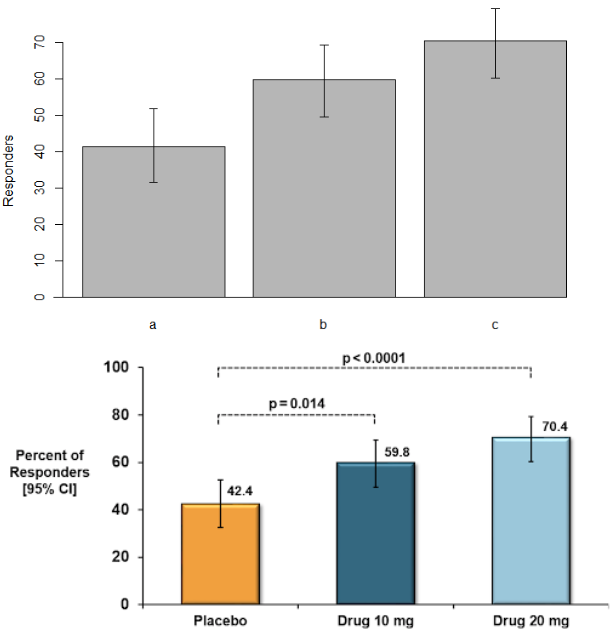
The easiest way to see what makes an effective data visualization is by example. The top and bottom panels below illustrate the hypothetical results of an efficacy endpoint based on the percentage of patients in each arm meeting a treatment responder definition.

Even though both charts are plotting identical data, the effectiveness of the visualizations is clearly different. I’ll walk through the four key design aspects for these figures informed by 3D Communications’ best practices.
Integrity
-
Both plots correctly show variability as 95% confidence intervals (CIs), reflecting the precision of the point estimate for each arm. CIs are preferred over other measures of variability such as standard errors or standard deviations for hypothesis-based endpoints because CIs can be used to make statistical inference. (Standard errors show precision but not in a way that is directly interpretable; standard deviations reflect variability of data but not precision of a point estimate.)
-
The y-axis on the plot in the top panel has an upper limit of 70%. While both graphs technically show the same numeric results, credible graphs should show the full range from 0% to 100%.
-
The figure on the top does not label the observed percentages or the sample size. Labels on graphs should be clear and thorough to overcome any ambiguity about the results. Provide relevant explanations on the graphic itself and label important events in the data when applicable.
Concept
-
The graph on the bottom uses different shades of blue for the active arms to compare to the placebo arm in orange. Using color can add another dimension to the graphic that informs the viewer and supports the continuity of results throughout a document. For example, if blue is consistently used to denote the active arm and orange is consistently used to denote the placebo arm across all bar charts, Kaplan-Meier plots, and line plots, the reader will have intuition about what data corresponds to which arm without having to reorient themselves for each figure. (Helpful hint: be sensitive to color-impaired readers. Blue can be distinguished by most color-impaired individuals, but avoid red and green.)
-
The p-values on the bottom figure also draw attention to the important comparisons and make the point that the results for this endpoint are statistically significant for both primary comparisons.
Function
-
Well-labeled graphs don’t require legends. Don’t make your reader have to play “legend tennis,” going back and forth from the figure to the footnote in order to understand the results. Label the treatment arms in a meaningful way with the study drug and the dose rather than letters that require a footnote.
-
No one reads a book or article at a 90-degree angle, so why would we want to read a graph that way? All words should run left to right, rather than vertically on the y-axis.
Form
-
Statistical packages like R and SAS can produce great graphics, but it requires time and effort to go beyond their “base” capabilities.
-
The ideal figure size is typically the “golden rectangle,” approximately a 1 to 1.7 ratio of height to length of the figure. Figures stretched too far left to right visually diminish the impact of differences between treatment arms, particularly for line charts or Kaplan-Meier plots.
Similar to how we approach writing, best practices for data visualizations should not be rigidly applied. Preparing a regulatory submission requires input from internal experts in medicine, statistics, and regulatory affairs. While we take it for granted that the text of regulatory submissions will undergo a thorough review by team members across disciplines, decisions on data visualizations are often left only to the statistical group. Garnering comments, questions, and suggestions on figures and graphs from the full sponsor team will ensure that data visualizations tell a compelling scientific story.